Brand Identity & Marketing
Professional Business Growth Flyer Design
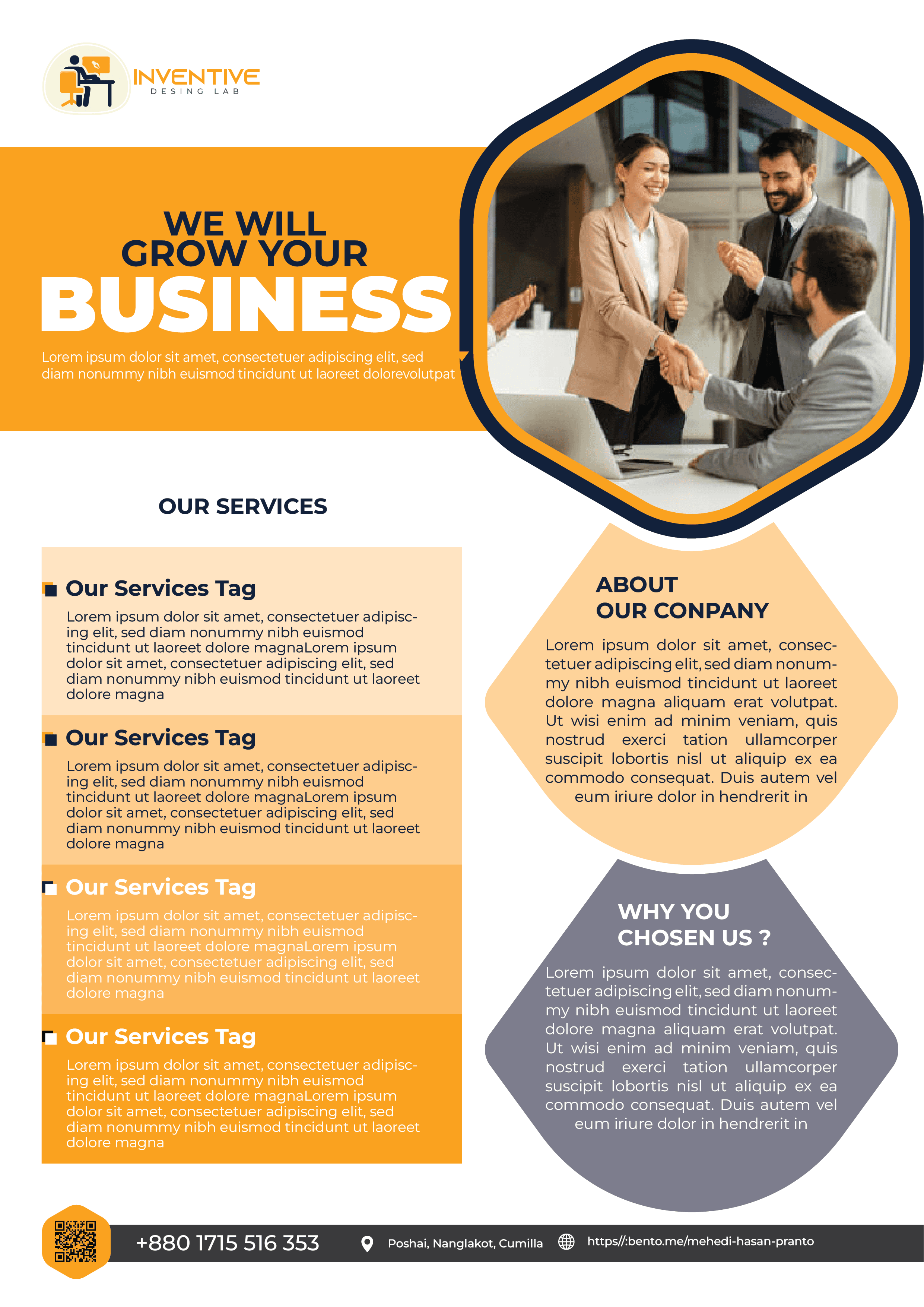
This professional corporate flyer features a vibrant yellow, orange, and navy blue color scheme with a clean, geometric layout.
Year :
2024
Industry :
Business
Client :
Inventive Design Lab
Project Duration :
2 Hours

Strategic Design for Success: An Analysis of the "Inventive Design Lab" Corporate Flyer
In the world of B2B marketing, a flyer serves as a visual handshake—a brief yet powerful introduction to a company’s capabilities and values. The corporate flyer for Inventive Design Lab is a prime example of how modern design principles can be used to communicate professionalism, growth, and reliability.
1. Color Psychology: Energy Meets Authority
The first thing that strikes the viewer is the vibrant color palette. The heavy use of yellow and orange is a deliberate choice; these colors evoke feelings of optimism, creativity, and energy—essential traits for a "Design Lab."
To balance this high-energy warmth, the designer integrated navy blue in the frames and the footer. Navy blue is the universal color of corporate stability and trust. By combining these, the flyer tells the viewer: "We are creative and energetic, but we are also a stable, professional partner you can rely on."
2. Geometric Dynamism
One of the most effective aspects of this layout is the use of non-traditional shapes. Instead of standard rectangular boxes, the design features:
The Hexagonal Hero: A large, navy-bordered hexagon houses the main image. This shape creates a sense of "connectivity" and "structure," much like a honeycomb, which is a powerful metaphor for business networking.
Diamond Sections: On the right side, diamond shapes separate the "About" and "Why Choose Us" sections. This breaks up the vertical flow of the page, making the content more engaging and less like a standard document.
3. Clear Information Hierarchy
A successful flyer must be "scannable." This design achieves this through a clear hierarchy of text:
The Hook: The bold, large-scale headline "WE WILL GROW YOUR BUSINESS" immediately identifies the value proposition.
The Service List: On the left, different shades of orange are used to categorize services. This color-coding helps the eye distinguish between different points quickly.
The Footer: By placing the contact information on a high-contrast dark background at the very bottom, the designer ensures that the "Call to Action" is the final, most grounded piece of information the reader sees.
4. Humanizing the Brand
The choice of imagery is crucial. The central photo shows professionals shaking hands and clapping in a bright, modern office. This humanizes the "Design Lab," moving it away from being a faceless entity to a team of real people who celebrate success and partnership. It reinforces the headline's promise of growth.
5. Bridging the Digital Gap
In a modern touch, the flyer includes a QR code in the bottom left corner. This is an essential feature for contemporary print marketing, allowing interested clients to move instantly from a physical flyer to a digital portfolio or contact form. It shows that Inventive Design Lab is tech-savvy and values the client’s time.
Conclusion
The Inventive Design Lab flyer is a well-calculated marketing tool. Through its bold use of color, unique geometric layout, and clear messaging, it successfully projects an image of a company that is both innovative and grounded. It doesn't just list services; it builds a narrative of partnership and professional success.
More Projects


Brand Identity & Marketing
Professional Business Growth Flyer Design
This professional corporate flyer features a vibrant yellow, orange, and navy blue color scheme with a clean, geometric layout.
Year :
2024
Industry :
Business
Client :
Inventive Design Lab
Project Duration :
2 Hours
Strategic Design for Success: An Analysis of the "Inventive Design Lab" Corporate Flyer
In the world of B2B marketing, a flyer serves as a visual handshake—a brief yet powerful introduction to a company’s capabilities and values. The corporate flyer for Inventive Design Lab is a prime example of how modern design principles can be used to communicate professionalism, growth, and reliability.
1. Color Psychology: Energy Meets Authority
The first thing that strikes the viewer is the vibrant color palette. The heavy use of yellow and orange is a deliberate choice; these colors evoke feelings of optimism, creativity, and energy—essential traits for a "Design Lab."
To balance this high-energy warmth, the designer integrated navy blue in the frames and the footer. Navy blue is the universal color of corporate stability and trust. By combining these, the flyer tells the viewer: "We are creative and energetic, but we are also a stable, professional partner you can rely on."
2. Geometric Dynamism
One of the most effective aspects of this layout is the use of non-traditional shapes. Instead of standard rectangular boxes, the design features:
The Hexagonal Hero: A large, navy-bordered hexagon houses the main image. This shape creates a sense of "connectivity" and "structure," much like a honeycomb, which is a powerful metaphor for business networking.
Diamond Sections: On the right side, diamond shapes separate the "About" and "Why Choose Us" sections. This breaks up the vertical flow of the page, making the content more engaging and less like a standard document.
3. Clear Information Hierarchy
A successful flyer must be "scannable." This design achieves this through a clear hierarchy of text:
The Hook: The bold, large-scale headline "WE WILL GROW YOUR BUSINESS" immediately identifies the value proposition.
The Service List: On the left, different shades of orange are used to categorize services. This color-coding helps the eye distinguish between different points quickly.
The Footer: By placing the contact information on a high-contrast dark background at the very bottom, the designer ensures that the "Call to Action" is the final, most grounded piece of information the reader sees.
4. Humanizing the Brand
The choice of imagery is crucial. The central photo shows professionals shaking hands and clapping in a bright, modern office. This humanizes the "Design Lab," moving it away from being a faceless entity to a team of real people who celebrate success and partnership. It reinforces the headline's promise of growth.
5. Bridging the Digital Gap
In a modern touch, the flyer includes a QR code in the bottom left corner. This is an essential feature for contemporary print marketing, allowing interested clients to move instantly from a physical flyer to a digital portfolio or contact form. It shows that Inventive Design Lab is tech-savvy and values the client’s time.
Conclusion
The Inventive Design Lab flyer is a well-calculated marketing tool. Through its bold use of color, unique geometric layout, and clear messaging, it successfully projects an image of a company that is both innovative and grounded. It doesn't just list services; it builds a narrative of partnership and professional success.
More Projects
Brand Identity & Marketing
Professional Business Growth Flyer Design
This professional corporate flyer features a vibrant yellow, orange, and navy blue color scheme with a clean, geometric layout.
Year :
2024
Industry :
Business
Client :
Inventive Design Lab
Project Duration :
2 Hours
Strategic Design for Success: An Analysis of the "Inventive Design Lab" Corporate Flyer
In the world of B2B marketing, a flyer serves as a visual handshake—a brief yet powerful introduction to a company’s capabilities and values. The corporate flyer for Inventive Design Lab is a prime example of how modern design principles can be used to communicate professionalism, growth, and reliability.
1. Color Psychology: Energy Meets Authority
The first thing that strikes the viewer is the vibrant color palette. The heavy use of yellow and orange is a deliberate choice; these colors evoke feelings of optimism, creativity, and energy—essential traits for a "Design Lab."
To balance this high-energy warmth, the designer integrated navy blue in the frames and the footer. Navy blue is the universal color of corporate stability and trust. By combining these, the flyer tells the viewer: "We are creative and energetic, but we are also a stable, professional partner you can rely on."
2. Geometric Dynamism
One of the most effective aspects of this layout is the use of non-traditional shapes. Instead of standard rectangular boxes, the design features:
The Hexagonal Hero: A large, navy-bordered hexagon houses the main image. This shape creates a sense of "connectivity" and "structure," much like a honeycomb, which is a powerful metaphor for business networking.
Diamond Sections: On the right side, diamond shapes separate the "About" and "Why Choose Us" sections. This breaks up the vertical flow of the page, making the content more engaging and less like a standard document.
3. Clear Information Hierarchy
A successful flyer must be "scannable." This design achieves this through a clear hierarchy of text:
The Hook: The bold, large-scale headline "WE WILL GROW YOUR BUSINESS" immediately identifies the value proposition.
The Service List: On the left, different shades of orange are used to categorize services. This color-coding helps the eye distinguish between different points quickly.
The Footer: By placing the contact information on a high-contrast dark background at the very bottom, the designer ensures that the "Call to Action" is the final, most grounded piece of information the reader sees.
4. Humanizing the Brand
The choice of imagery is crucial. The central photo shows professionals shaking hands and clapping in a bright, modern office. This humanizes the "Design Lab," moving it away from being a faceless entity to a team of real people who celebrate success and partnership. It reinforces the headline's promise of growth.
5. Bridging the Digital Gap
In a modern touch, the flyer includes a QR code in the bottom left corner. This is an essential feature for contemporary print marketing, allowing interested clients to move instantly from a physical flyer to a digital portfolio or contact form. It shows that Inventive Design Lab is tech-savvy and values the client’s time.
Conclusion
The Inventive Design Lab flyer is a well-calculated marketing tool. Through its bold use of color, unique geometric layout, and clear messaging, it successfully projects an image of a company that is both innovative and grounded. It doesn't just list services; it builds a narrative of partnership and professional success.