Brand Identity & Marketing
Personal Branding Exploration – A Study in Geometry & Color
A comparative personal branding project showcasing two distinct visual identities. This suite features minimalist stationery designs, including business cards and envelopes, exploring how sharp geometric angles versus fluid organic shapes can communicate different professional personas—from structured architectural precision to vibrant, approachable creativity.
Year :
2023
Industry :
-
Client :
-
Project Duration :
-

Problem :
As a designer, my identity is not fixed; it evolves with the projects I undertake. This project, titled "The Duality of Design," was an exercise in personal branding. I created two separate stationery suites (Business Cards & Envelopes) to demonstrate my versatility in visual storytelling. One focuses on Precision and Structure, while the other explores Fluidity and Energy.
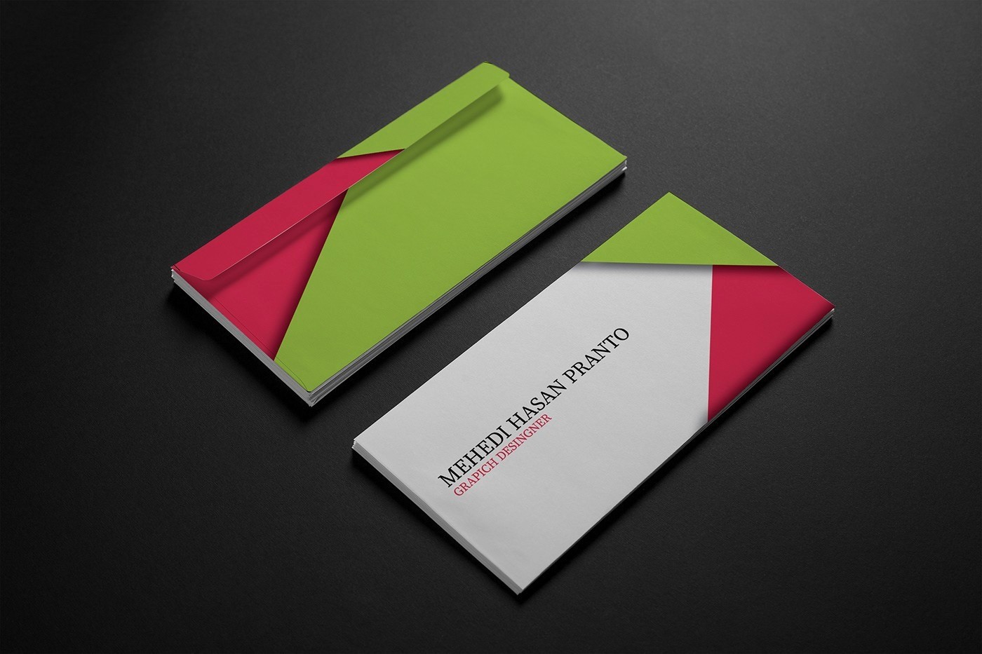
Design Concept 1: Structured Minimalism (Sharp & Bold)
The Vision: This design (Green/Pink) is intended for a corporate yet creative environment.
Geometry: I used sharp diagonal shapes to create "visual tension" and energy. The overlapping triangles symbolize growth and forward-thinking.
Color Palette: The lime green represents innovation, while the dark pink adds a touch of creative passion.
Typography: A classic serif font for the name conveys elegance and authority, balanced by a modern sans-serif for the job title.
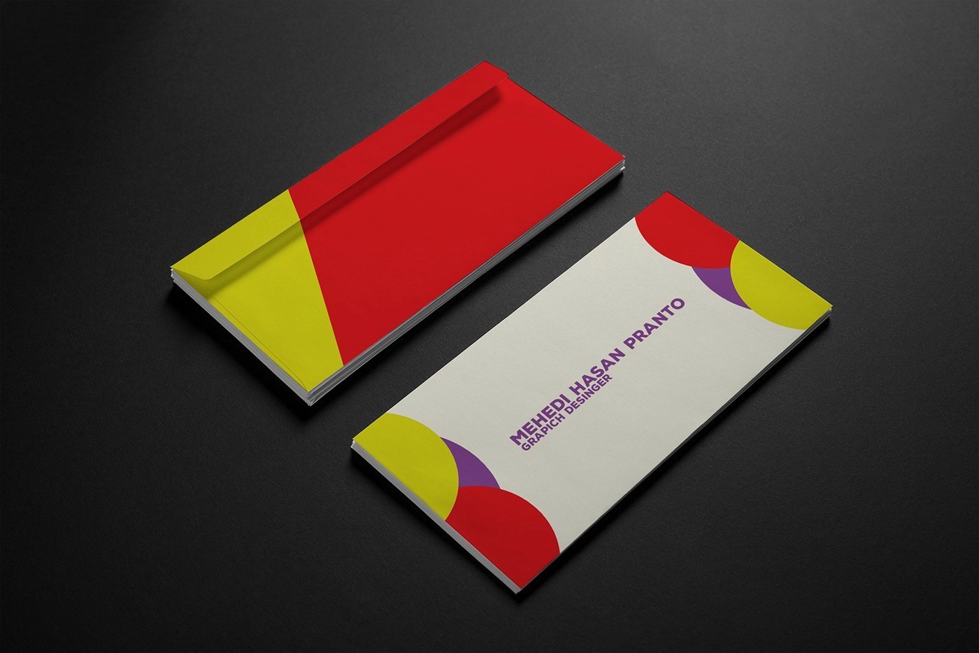
Design Concept 2: Organic Playfulness (Circles & Vibrancy)
The Vision: This design (Red/Yellow/Purple) is crafted for a friendly, approachable, and highly creative persona.
Geometry: Circles represent unity, community, and accessibility. By overlapping these organic shapes with varying levels of transparency, I created a sense of connectivity and depth.
Color Palette: A vibrant mix of primary-adjacent colors makes the brand feel energetic and welcoming.
Typography: The use of a bold, rounded sans-serif font makes the brand feel modern and "tech-friendly."
Functional Design & Presentation
Both suites were designed with "Print-Ready" standards in mind. The envelopes follow the same geometric patterns to ensure a cohesive brand experience from the first touch. I utilized 3D isometric mockups to showcase how the light interacts with the paper textures, highlighting the premium quality of the designs.
Tools Used
Adobe Illustrator: For precise vector-based geometric compositions.
Adobe Photoshop: For high-end 3D mockup rendering and color balancing.
More Projects


Brand Identity & Marketing
Personal Branding Exploration – A Study in Geometry & Color
A comparative personal branding project showcasing two distinct visual identities. This suite features minimalist stationery designs, including business cards and envelopes, exploring how sharp geometric angles versus fluid organic shapes can communicate different professional personas—from structured architectural precision to vibrant, approachable creativity.
Year :
2023
Industry :
-
Client :
-
Project Duration :
-
Problem :
As a designer, my identity is not fixed; it evolves with the projects I undertake. This project, titled "The Duality of Design," was an exercise in personal branding. I created two separate stationery suites (Business Cards & Envelopes) to demonstrate my versatility in visual storytelling. One focuses on Precision and Structure, while the other explores Fluidity and Energy.
Design Concept 1: Structured Minimalism (Sharp & Bold)
The Vision: This design (Green/Pink) is intended for a corporate yet creative environment.
Geometry: I used sharp diagonal shapes to create "visual tension" and energy. The overlapping triangles symbolize growth and forward-thinking.
Color Palette: The lime green represents innovation, while the dark pink adds a touch of creative passion.
Typography: A classic serif font for the name conveys elegance and authority, balanced by a modern sans-serif for the job title.
Design Concept 2: Organic Playfulness (Circles & Vibrancy)
The Vision: This design (Red/Yellow/Purple) is crafted for a friendly, approachable, and highly creative persona.
Geometry: Circles represent unity, community, and accessibility. By overlapping these organic shapes with varying levels of transparency, I created a sense of connectivity and depth.
Color Palette: A vibrant mix of primary-adjacent colors makes the brand feel energetic and welcoming.
Typography: The use of a bold, rounded sans-serif font makes the brand feel modern and "tech-friendly."
Functional Design & Presentation
Both suites were designed with "Print-Ready" standards in mind. The envelopes follow the same geometric patterns to ensure a cohesive brand experience from the first touch. I utilized 3D isometric mockups to showcase how the light interacts with the paper textures, highlighting the premium quality of the designs.
Tools Used
Adobe Illustrator: For precise vector-based geometric compositions.
Adobe Photoshop: For high-end 3D mockup rendering and color balancing.
More Projects
Brand Identity & Marketing
Personal Branding Exploration – A Study in Geometry & Color
A comparative personal branding project showcasing two distinct visual identities. This suite features minimalist stationery designs, including business cards and envelopes, exploring how sharp geometric angles versus fluid organic shapes can communicate different professional personas—from structured architectural precision to vibrant, approachable creativity.
Year :
2023
Industry :
-
Client :
-
Project Duration :
-
Problem :
As a designer, my identity is not fixed; it evolves with the projects I undertake. This project, titled "The Duality of Design," was an exercise in personal branding. I created two separate stationery suites (Business Cards & Envelopes) to demonstrate my versatility in visual storytelling. One focuses on Precision and Structure, while the other explores Fluidity and Energy.
Design Concept 1: Structured Minimalism (Sharp & Bold)
The Vision: This design (Green/Pink) is intended for a corporate yet creative environment.
Geometry: I used sharp diagonal shapes to create "visual tension" and energy. The overlapping triangles symbolize growth and forward-thinking.
Color Palette: The lime green represents innovation, while the dark pink adds a touch of creative passion.
Typography: A classic serif font for the name conveys elegance and authority, balanced by a modern sans-serif for the job title.
Design Concept 2: Organic Playfulness (Circles & Vibrancy)
The Vision: This design (Red/Yellow/Purple) is crafted for a friendly, approachable, and highly creative persona.
Geometry: Circles represent unity, community, and accessibility. By overlapping these organic shapes with varying levels of transparency, I created a sense of connectivity and depth.
Color Palette: A vibrant mix of primary-adjacent colors makes the brand feel energetic and welcoming.
Typography: The use of a bold, rounded sans-serif font makes the brand feel modern and "tech-friendly."
Functional Design & Presentation
Both suites were designed with "Print-Ready" standards in mind. The envelopes follow the same geometric patterns to ensure a cohesive brand experience from the first touch. I utilized 3D isometric mockups to showcase how the light interacts with the paper textures, highlighting the premium quality of the designs.
Tools Used
Adobe Illustrator: For precise vector-based geometric compositions.
Adobe Photoshop: For high-end 3D mockup rendering and color balancing.