Brand Identity & Marketing
Nivea Refreshing Wash Gel – Premium Product Visualization & Ad Design
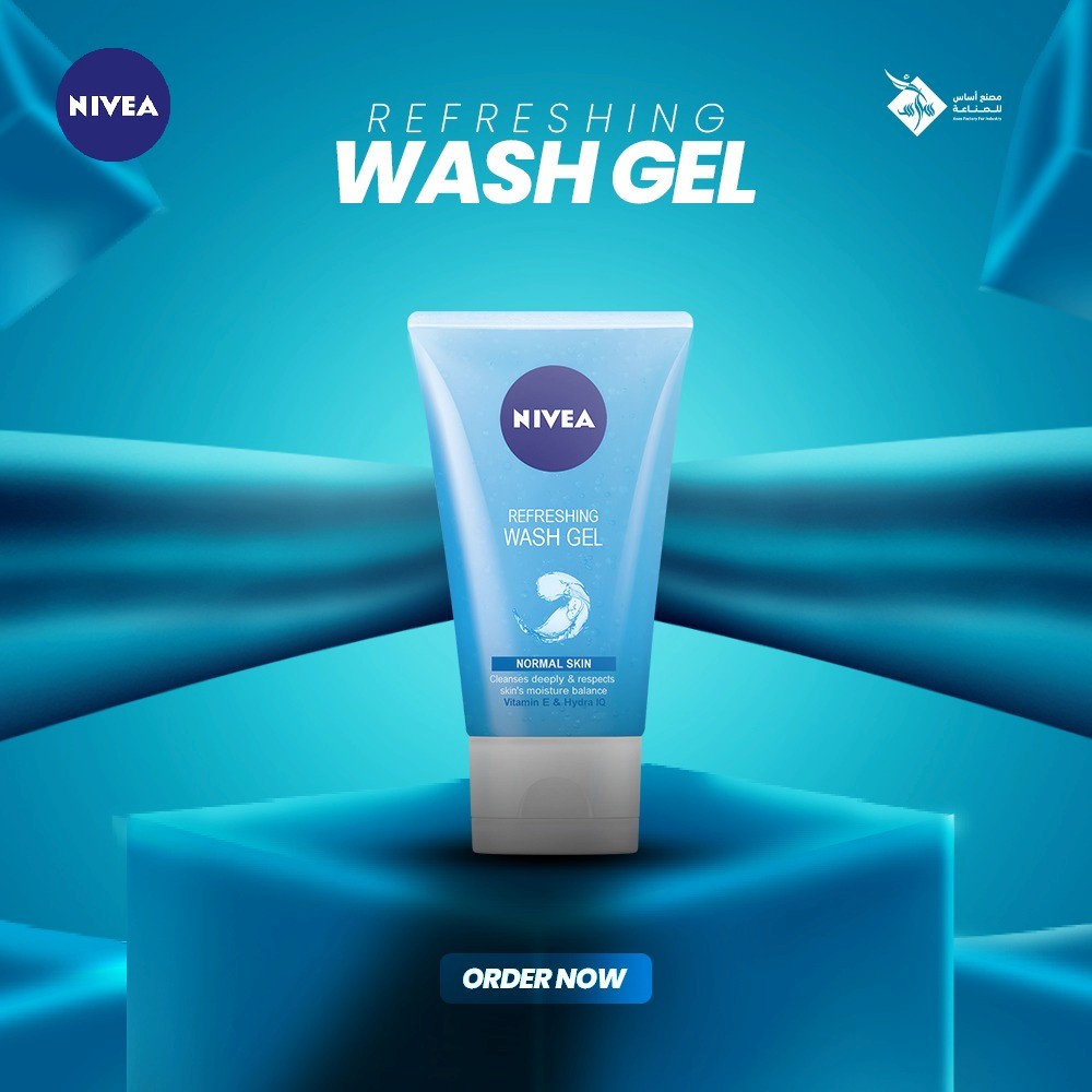
A professional social media advertisement designed for Nivea Refreshing Wash Gel. This project focuses on brand-centric aesthetics, utilizing Nivea’s iconic blue palette, 3D geometric staging, and dynamic textures. The design is engineered to project a sense of "cleanliness and freshness" while maintaining a premium look suitable for high-end skincare marketing.
Year :
2024
Industry :
-
Client :
-
Project Duration :
-

The Essence of Freshness: A Deep Dive into Nivea Product Branding
In the world of skincare marketing, the visual identity must be as refreshing as the product itself. For this campaign featuring Nivea Refreshing Wash Gel, my objective was to create a digital advertisement that feels both laboratory-clean and luxuriously premium.
1. Brand-Centric Color Strategy
Nivea is defined by its iconic Dark Blue and White identity. I expanded this into a vibrant, monochromatic blue-to-teal gradient. Blue is psychologically associated with trust, water, and hygiene, making it the perfect foundation for a facial wash product. The consistent use of blue tones ensures instant brand recall for the consumer.
2. 3D Staging & Product Heroism
To give the product a "Hero" status, I placed the tube on a 3D geometric pedestal. This elevation suggests a premium quality, lifting the product above the ordinary. The lighting on the pedestal was carefully crafted to create depth and shadows, giving the overall composition a realistic, three-dimensional feel.
3. Dynamic Flow & Texture
One of the key features of this design is the use of flowing blue silk/fabric elements in the background.
The Movement: These abstract shapes add a sense of motion and energy to a static image.
The Metaphor: The smooth, flowing texture of the fabric mimics the "gel" consistency of the product and the "refreshing" sensation it provides to the skin. It adds a layer of luxury and sophistication to the branding.
4. Typography & Information Hierarchy
I used a bold, modern sans-serif typeface for "WASH GEL" to ensure maximum legibility. The white text stands out sharply against the blue background, following a clean, minimalist hierarchy. The top-left Nivea logo and top-right factory branding provide professional anchors, while the "ORDER NOW" button at the base offers a clear, high-contrast call to action.
5. Technical Excellence
Software Suite: Adobe Photoshop (Advanced Compositing, 3D Lighting, and Color Harmonization).
Techniques: Digital staging, rim lighting to accentuate product edges, and frequency separation for a clean, high-definition finish.
Conclusion
The Nivea Refreshing Wash Gel advertisement is more than just a graphic; it’s a visual experience built on brand trust. By combining 3D elements with dynamic textures and strategic lighting, I successfully created a marketing asset that doesn't just show a product—it promises a feeling of freshness.
More Projects


Brand Identity & Marketing
Nivea Refreshing Wash Gel – Premium Product Visualization & Ad Design
A professional social media advertisement designed for Nivea Refreshing Wash Gel. This project focuses on brand-centric aesthetics, utilizing Nivea’s iconic blue palette, 3D geometric staging, and dynamic textures. The design is engineered to project a sense of "cleanliness and freshness" while maintaining a premium look suitable for high-end skincare marketing.
Year :
2024
Industry :
-
Client :
-
Project Duration :
-
The Essence of Freshness: A Deep Dive into Nivea Product Branding
In the world of skincare marketing, the visual identity must be as refreshing as the product itself. For this campaign featuring Nivea Refreshing Wash Gel, my objective was to create a digital advertisement that feels both laboratory-clean and luxuriously premium.
1. Brand-Centric Color Strategy
Nivea is defined by its iconic Dark Blue and White identity. I expanded this into a vibrant, monochromatic blue-to-teal gradient. Blue is psychologically associated with trust, water, and hygiene, making it the perfect foundation for a facial wash product. The consistent use of blue tones ensures instant brand recall for the consumer.
2. 3D Staging & Product Heroism
To give the product a "Hero" status, I placed the tube on a 3D geometric pedestal. This elevation suggests a premium quality, lifting the product above the ordinary. The lighting on the pedestal was carefully crafted to create depth and shadows, giving the overall composition a realistic, three-dimensional feel.
3. Dynamic Flow & Texture
One of the key features of this design is the use of flowing blue silk/fabric elements in the background.
The Movement: These abstract shapes add a sense of motion and energy to a static image.
The Metaphor: The smooth, flowing texture of the fabric mimics the "gel" consistency of the product and the "refreshing" sensation it provides to the skin. It adds a layer of luxury and sophistication to the branding.
4. Typography & Information Hierarchy
I used a bold, modern sans-serif typeface for "WASH GEL" to ensure maximum legibility. The white text stands out sharply against the blue background, following a clean, minimalist hierarchy. The top-left Nivea logo and top-right factory branding provide professional anchors, while the "ORDER NOW" button at the base offers a clear, high-contrast call to action.
5. Technical Excellence
Software Suite: Adobe Photoshop (Advanced Compositing, 3D Lighting, and Color Harmonization).
Techniques: Digital staging, rim lighting to accentuate product edges, and frequency separation for a clean, high-definition finish.
Conclusion
The Nivea Refreshing Wash Gel advertisement is more than just a graphic; it’s a visual experience built on brand trust. By combining 3D elements with dynamic textures and strategic lighting, I successfully created a marketing asset that doesn't just show a product—it promises a feeling of freshness.
More Projects
Brand Identity & Marketing
Nivea Refreshing Wash Gel – Premium Product Visualization & Ad Design
A professional social media advertisement designed for Nivea Refreshing Wash Gel. This project focuses on brand-centric aesthetics, utilizing Nivea’s iconic blue palette, 3D geometric staging, and dynamic textures. The design is engineered to project a sense of "cleanliness and freshness" while maintaining a premium look suitable for high-end skincare marketing.
Year :
2024
Industry :
-
Client :
-
Project Duration :
-
The Essence of Freshness: A Deep Dive into Nivea Product Branding
In the world of skincare marketing, the visual identity must be as refreshing as the product itself. For this campaign featuring Nivea Refreshing Wash Gel, my objective was to create a digital advertisement that feels both laboratory-clean and luxuriously premium.
1. Brand-Centric Color Strategy
Nivea is defined by its iconic Dark Blue and White identity. I expanded this into a vibrant, monochromatic blue-to-teal gradient. Blue is psychologically associated with trust, water, and hygiene, making it the perfect foundation for a facial wash product. The consistent use of blue tones ensures instant brand recall for the consumer.
2. 3D Staging & Product Heroism
To give the product a "Hero" status, I placed the tube on a 3D geometric pedestal. This elevation suggests a premium quality, lifting the product above the ordinary. The lighting on the pedestal was carefully crafted to create depth and shadows, giving the overall composition a realistic, three-dimensional feel.
3. Dynamic Flow & Texture
One of the key features of this design is the use of flowing blue silk/fabric elements in the background.
The Movement: These abstract shapes add a sense of motion and energy to a static image.
The Metaphor: The smooth, flowing texture of the fabric mimics the "gel" consistency of the product and the "refreshing" sensation it provides to the skin. It adds a layer of luxury and sophistication to the branding.
4. Typography & Information Hierarchy
I used a bold, modern sans-serif typeface for "WASH GEL" to ensure maximum legibility. The white text stands out sharply against the blue background, following a clean, minimalist hierarchy. The top-left Nivea logo and top-right factory branding provide professional anchors, while the "ORDER NOW" button at the base offers a clear, high-contrast call to action.
5. Technical Excellence
Software Suite: Adobe Photoshop (Advanced Compositing, 3D Lighting, and Color Harmonization).
Techniques: Digital staging, rim lighting to accentuate product edges, and frequency separation for a clean, high-definition finish.
Conclusion
The Nivea Refreshing Wash Gel advertisement is more than just a graphic; it’s a visual experience built on brand trust. By combining 3D elements with dynamic textures and strategic lighting, I successfully created a marketing asset that doesn't just show a product—it promises a feeling of freshness.