Brand Identity & Marketing
Modern Geometric Corporate Identity & Stationery
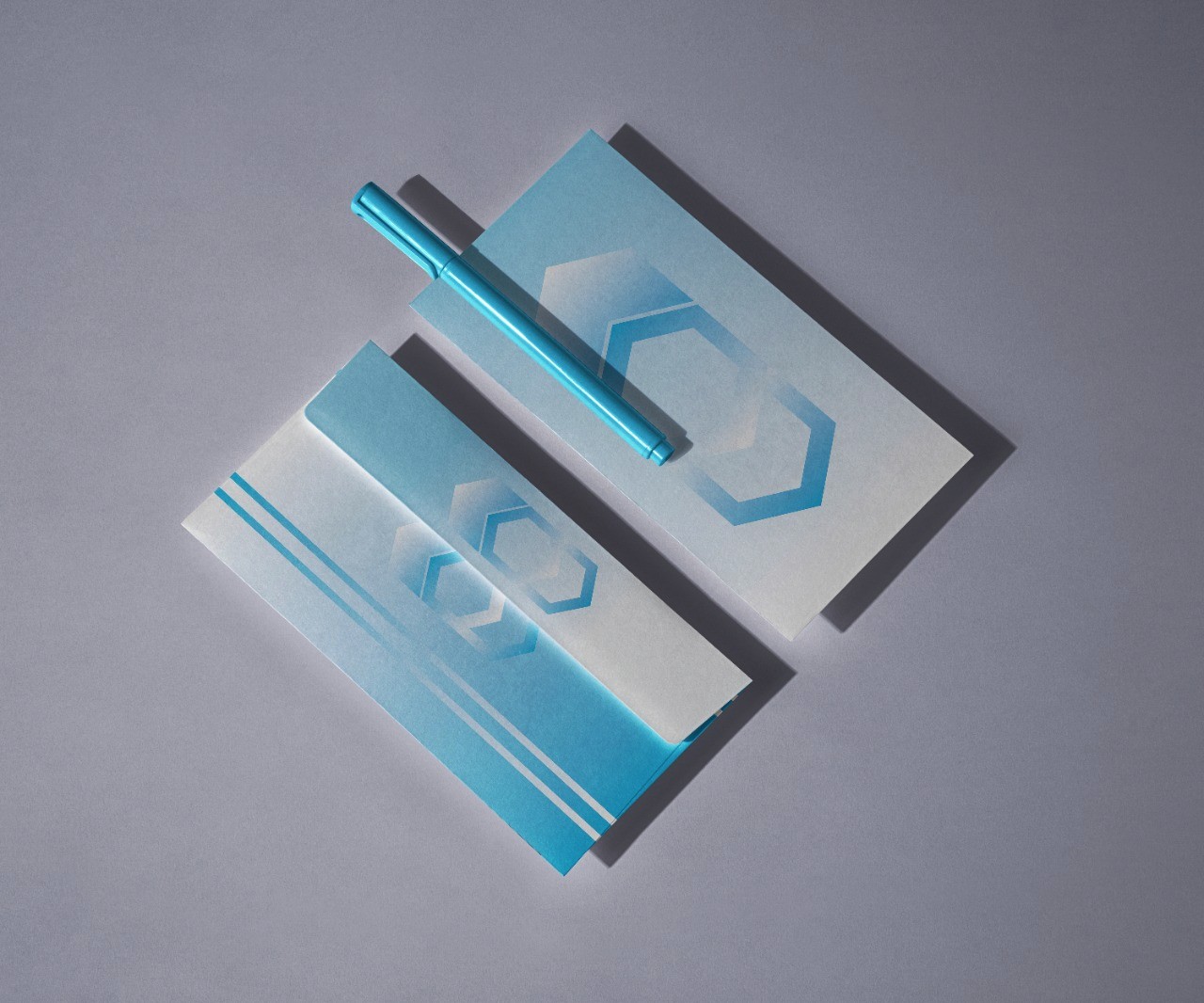
This project features a minimalist branding concept utilizing abstract geometric icons and soft blue gradients. The design emphasizes professional sophistication and clean tech aesthetics.
Year :
2023
Industry :
-
Client :
-
Project Duration :
3 Hours

Minimalist Tech Identity – Corporate Stationery Suite
Project Overview
This project focuses on creating a clean, modern, and abstract visual identity for a corporate entity, primarily focused on the technology or creative sectors. The design emphasizes Minimalism and Geometric Harmony, showcasing a cohesive look through a custom-designed stationery set including envelopes and matching accessories.
The Challenge
The objective was to create a brand identity that feels professional and trustworthy without being overly complex. The challenge lay in using a single geometric shape and a limited color palette to convey a sense of structure, innovation, and digital connectivity.
Design Approach & Case Study
I adopted a "Less is More" philosophy to ensure the brand remains timeless and versatile:
Geometric Symbolism: The core of the identity is a stylized hexagonal/geometric icon. Hexagons are often associated with technology, security, and organization (like a honeycomb). By layering these shapes with varying opacities, I created a sense of depth and transparency.
Color Psychology (The Power of Blue): I utilized a soft blue gradient palette. Blue is universally recognized as the color of trust, intelligence, and stability. The gradients add a modern "glassmorphism" touch, making the brand feel contemporary and tech-forward.
Minimalist Layout: On the stationery, I kept the design elements subtle. The use of clean white space contrasted with blue linear accents ensures that the brand looks premium and sophisticated.
Tangible Application: To demonstrate the brand’s real-world impact, I used a high-quality mockup. Seeing the design on physical items like envelopes and pens helps the client visualize how the brand will exist in a professional office environment.
Visual Balance: The composition relies on the balance between the abstract icons and the clean surfaces, ensuring that the branding is recognizable but not distracting.
Tools Used
Adobe Illustrator: For creating the precise geometric vector icons.
Adobe Photoshop: For applying the branding to professional mockups and color grading.
More Projects


Brand Identity & Marketing
Modern Geometric Corporate Identity & Stationery
This project features a minimalist branding concept utilizing abstract geometric icons and soft blue gradients. The design emphasizes professional sophistication and clean tech aesthetics.
Year :
2023
Industry :
-
Client :
-
Project Duration :
3 Hours
Minimalist Tech Identity – Corporate Stationery Suite
Project Overview
This project focuses on creating a clean, modern, and abstract visual identity for a corporate entity, primarily focused on the technology or creative sectors. The design emphasizes Minimalism and Geometric Harmony, showcasing a cohesive look through a custom-designed stationery set including envelopes and matching accessories.
The Challenge
The objective was to create a brand identity that feels professional and trustworthy without being overly complex. The challenge lay in using a single geometric shape and a limited color palette to convey a sense of structure, innovation, and digital connectivity.
Design Approach & Case Study
I adopted a "Less is More" philosophy to ensure the brand remains timeless and versatile:
Geometric Symbolism: The core of the identity is a stylized hexagonal/geometric icon. Hexagons are often associated with technology, security, and organization (like a honeycomb). By layering these shapes with varying opacities, I created a sense of depth and transparency.
Color Psychology (The Power of Blue): I utilized a soft blue gradient palette. Blue is universally recognized as the color of trust, intelligence, and stability. The gradients add a modern "glassmorphism" touch, making the brand feel contemporary and tech-forward.
Minimalist Layout: On the stationery, I kept the design elements subtle. The use of clean white space contrasted with blue linear accents ensures that the brand looks premium and sophisticated.
Tangible Application: To demonstrate the brand’s real-world impact, I used a high-quality mockup. Seeing the design on physical items like envelopes and pens helps the client visualize how the brand will exist in a professional office environment.
Visual Balance: The composition relies on the balance between the abstract icons and the clean surfaces, ensuring that the branding is recognizable but not distracting.
Tools Used
Adobe Illustrator: For creating the precise geometric vector icons.
Adobe Photoshop: For applying the branding to professional mockups and color grading.
More Projects
Brand Identity & Marketing
Modern Geometric Corporate Identity & Stationery
This project features a minimalist branding concept utilizing abstract geometric icons and soft blue gradients. The design emphasizes professional sophistication and clean tech aesthetics.
Year :
2023
Industry :
-
Client :
-
Project Duration :
3 Hours
Minimalist Tech Identity – Corporate Stationery Suite
Project Overview
This project focuses on creating a clean, modern, and abstract visual identity for a corporate entity, primarily focused on the technology or creative sectors. The design emphasizes Minimalism and Geometric Harmony, showcasing a cohesive look through a custom-designed stationery set including envelopes and matching accessories.
The Challenge
The objective was to create a brand identity that feels professional and trustworthy without being overly complex. The challenge lay in using a single geometric shape and a limited color palette to convey a sense of structure, innovation, and digital connectivity.
Design Approach & Case Study
I adopted a "Less is More" philosophy to ensure the brand remains timeless and versatile:
Geometric Symbolism: The core of the identity is a stylized hexagonal/geometric icon. Hexagons are often associated with technology, security, and organization (like a honeycomb). By layering these shapes with varying opacities, I created a sense of depth and transparency.
Color Psychology (The Power of Blue): I utilized a soft blue gradient palette. Blue is universally recognized as the color of trust, intelligence, and stability. The gradients add a modern "glassmorphism" touch, making the brand feel contemporary and tech-forward.
Minimalist Layout: On the stationery, I kept the design elements subtle. The use of clean white space contrasted with blue linear accents ensures that the brand looks premium and sophisticated.
Tangible Application: To demonstrate the brand’s real-world impact, I used a high-quality mockup. Seeing the design on physical items like envelopes and pens helps the client visualize how the brand will exist in a professional office environment.
Visual Balance: The composition relies on the balance between the abstract icons and the clean surfaces, ensuring that the branding is recognizable but not distracting.
Tools Used
Adobe Illustrator: For creating the precise geometric vector icons.
Adobe Photoshop: For applying the branding to professional mockups and color grading.