Brand Identity & Marketing
Golden Crunch – Modern Social Media Campaign for Fired Chicken
A minimalist and vibrant social media advertisement designed for a premium fried chicken brand. This project focuses on high-impact food photography set against a warm, textured background to evoke "Appetite Appeal." The design utilizes bold, clean typography and a strategic layout to highlight weekly offers and drive immediate customer orders.
Year :
2024
Industry :
-
Client :
-
Project Duration :
-

The Art of Sizzle: Designing a Conversion-Focused Ad for "Fired Chicken"
In the digital food marketplace, an advertisement must do more than just show food—it must make the viewer "taste" the image. For the "Fired Chicken" project, my goal was to break away from cluttered, traditional food flyers and move toward a modern, clean, and high-energy aesthetic that appeals to the younger, tech-savvy consumer.
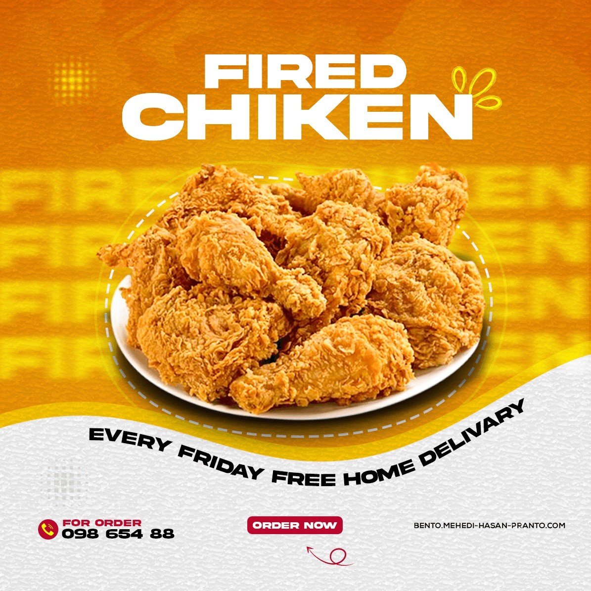
1. Visual Strategy: Color and Texture
I chose a vibrant Orange and Yellow palette as the primary theme. In food marketing, these colors are scientifically proven to stimulate appetite and create a sense of warmth and happiness. To add a premium, "artisanal" feel, I applied a subtle paper/grain texture to the background. This moves the design away from a flat digital look and gives it a tactile, high-quality finish.
2. High-Impact Food Retouching
The center-weighted platter of fried chicken is the "Hero" of this design. I performed advanced color correction and sharpening to enhance the golden-brown crust of the chicken. By increasing the micro-contrast, I ensured that every "crunch" is visible, which is essential for triggering a sensory response in the viewer.
3. Minimalist Typography & Branding
Unlike traditional flyers that use complex fonts, I opted for a Bold, Extended Sans-Serif typeface for the headline "FIRED CHIKEN." This choice provides a modern, "street-food" yet professional vibe. The secondary text—"EVERY FRIDAY FREE HOME DELIVERY"—follows a curved path, adding a dynamic "seal-like" quality that emphasizes the special offer without cluttering the main visual area.
4. Conversion-Driven Layout (Information Architecture)
A professional ad must guide the eye toward a sale. I structured the information hierarchy as follows:
The Identity: Bold headline for instant recognition.
The Hook: The "Free Delivery" offer as a secondary motivator.
The Product: The appetizing visual to seal the deal.
The Action: A high-contrast "ORDER NOW" button and clear contact details at the base, providing a frictionless path to purchase.
5. Technical Excellence
Software Suite: Adobe Photoshop (Advanced Masking, Color Harmonization, and Digital Retouching).
Techniques: Perspective manipulation for the curved text and custom lighting effects to give the chicken platter a 3D "pop" off the background.
Conclusion
The "Fired Chicken" campaign demonstrates my ability to blend marketing psychology with high-end digital artistry. By focusing on clean lines, warm tones, and professional product presentation, I created a visual tool that doesn't just promote a meal but builds a premium brand experience.
More Projects


Brand Identity & Marketing
Golden Crunch – Modern Social Media Campaign for Fired Chicken
A minimalist and vibrant social media advertisement designed for a premium fried chicken brand. This project focuses on high-impact food photography set against a warm, textured background to evoke "Appetite Appeal." The design utilizes bold, clean typography and a strategic layout to highlight weekly offers and drive immediate customer orders.
Year :
2024
Industry :
-
Client :
-
Project Duration :
-
The Art of Sizzle: Designing a Conversion-Focused Ad for "Fired Chicken"
In the digital food marketplace, an advertisement must do more than just show food—it must make the viewer "taste" the image. For the "Fired Chicken" project, my goal was to break away from cluttered, traditional food flyers and move toward a modern, clean, and high-energy aesthetic that appeals to the younger, tech-savvy consumer.
1. Visual Strategy: Color and Texture
I chose a vibrant Orange and Yellow palette as the primary theme. In food marketing, these colors are scientifically proven to stimulate appetite and create a sense of warmth and happiness. To add a premium, "artisanal" feel, I applied a subtle paper/grain texture to the background. This moves the design away from a flat digital look and gives it a tactile, high-quality finish.
2. High-Impact Food Retouching
The center-weighted platter of fried chicken is the "Hero" of this design. I performed advanced color correction and sharpening to enhance the golden-brown crust of the chicken. By increasing the micro-contrast, I ensured that every "crunch" is visible, which is essential for triggering a sensory response in the viewer.
3. Minimalist Typography & Branding
Unlike traditional flyers that use complex fonts, I opted for a Bold, Extended Sans-Serif typeface for the headline "FIRED CHIKEN." This choice provides a modern, "street-food" yet professional vibe. The secondary text—"EVERY FRIDAY FREE HOME DELIVERY"—follows a curved path, adding a dynamic "seal-like" quality that emphasizes the special offer without cluttering the main visual area.
4. Conversion-Driven Layout (Information Architecture)
A professional ad must guide the eye toward a sale. I structured the information hierarchy as follows:
The Identity: Bold headline for instant recognition.
The Hook: The "Free Delivery" offer as a secondary motivator.
The Product: The appetizing visual to seal the deal.
The Action: A high-contrast "ORDER NOW" button and clear contact details at the base, providing a frictionless path to purchase.
5. Technical Excellence
Software Suite: Adobe Photoshop (Advanced Masking, Color Harmonization, and Digital Retouching).
Techniques: Perspective manipulation for the curved text and custom lighting effects to give the chicken platter a 3D "pop" off the background.
Conclusion
The "Fired Chicken" campaign demonstrates my ability to blend marketing psychology with high-end digital artistry. By focusing on clean lines, warm tones, and professional product presentation, I created a visual tool that doesn't just promote a meal but builds a premium brand experience.
More Projects
Brand Identity & Marketing
Golden Crunch – Modern Social Media Campaign for Fired Chicken
A minimalist and vibrant social media advertisement designed for a premium fried chicken brand. This project focuses on high-impact food photography set against a warm, textured background to evoke "Appetite Appeal." The design utilizes bold, clean typography and a strategic layout to highlight weekly offers and drive immediate customer orders.
Year :
2024
Industry :
-
Client :
-
Project Duration :
-
The Art of Sizzle: Designing a Conversion-Focused Ad for "Fired Chicken"
In the digital food marketplace, an advertisement must do more than just show food—it must make the viewer "taste" the image. For the "Fired Chicken" project, my goal was to break away from cluttered, traditional food flyers and move toward a modern, clean, and high-energy aesthetic that appeals to the younger, tech-savvy consumer.
1. Visual Strategy: Color and Texture
I chose a vibrant Orange and Yellow palette as the primary theme. In food marketing, these colors are scientifically proven to stimulate appetite and create a sense of warmth and happiness. To add a premium, "artisanal" feel, I applied a subtle paper/grain texture to the background. This moves the design away from a flat digital look and gives it a tactile, high-quality finish.
2. High-Impact Food Retouching
The center-weighted platter of fried chicken is the "Hero" of this design. I performed advanced color correction and sharpening to enhance the golden-brown crust of the chicken. By increasing the micro-contrast, I ensured that every "crunch" is visible, which is essential for triggering a sensory response in the viewer.
3. Minimalist Typography & Branding
Unlike traditional flyers that use complex fonts, I opted for a Bold, Extended Sans-Serif typeface for the headline "FIRED CHIKEN." This choice provides a modern, "street-food" yet professional vibe. The secondary text—"EVERY FRIDAY FREE HOME DELIVERY"—follows a curved path, adding a dynamic "seal-like" quality that emphasizes the special offer without cluttering the main visual area.
4. Conversion-Driven Layout (Information Architecture)
A professional ad must guide the eye toward a sale. I structured the information hierarchy as follows:
The Identity: Bold headline for instant recognition.
The Hook: The "Free Delivery" offer as a secondary motivator.
The Product: The appetizing visual to seal the deal.
The Action: A high-contrast "ORDER NOW" button and clear contact details at the base, providing a frictionless path to purchase.
5. Technical Excellence
Software Suite: Adobe Photoshop (Advanced Masking, Color Harmonization, and Digital Retouching).
Techniques: Perspective manipulation for the curved text and custom lighting effects to give the chicken platter a 3D "pop" off the background.
Conclusion
The "Fired Chicken" campaign demonstrates my ability to blend marketing psychology with high-end digital artistry. By focusing on clean lines, warm tones, and professional product presentation, I created a visual tool that doesn't just promote a meal but builds a premium brand experience.