Brand Identity & Marketing
Creative Identity – Professional Resume & Personal Branding
A modern, high-impact resume design showcasing a balanced two-column layout for maximum readability. This project serves as a personal brand identity, utilizing a clean navy blue and light teal color palette. It is engineered to present 5 years of industry experience, technical skills, and educational background in a visually engaging, professional format.
Year :
2024
Industry :
-
Client :
-
Project Duration :
-

Designing the Designer's Identity
As a graphic designer, your resume is often the very first project a potential client or employer sees. It is more than just a list of facts; it is a demonstration of your ability to organize complex information into a beautiful, scannable experience.
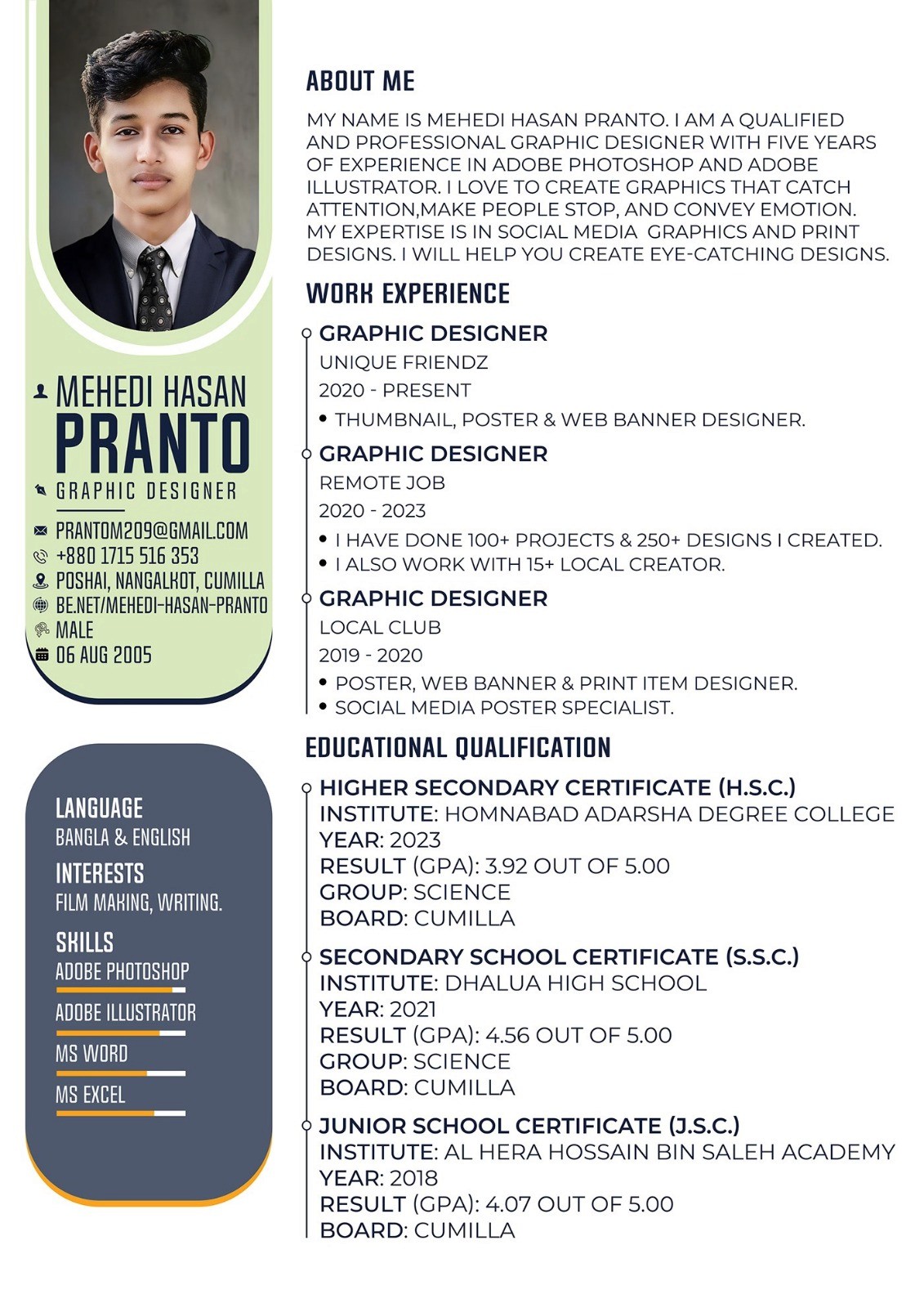
1. The Layout Strategy: Scan ability First
I chose a Modern Two-Column Layout to ensure the document is easy to navigate.
The Left Sidebar: Acting as a "Fast-Track" info center, this section houses my portrait, contact details, and technical skill bars. This allows a recruiter to understand my core competencies in less than 5 seconds.
The Main Body: Dedicated to my professional narrative. By using clear headers like "About Me," "Work Experience," and "Education," I ensured a logical flow of information that guides the reader’s eye downward.
2. Visual Branding & Color Theory
Navy Blue & Slate: I used these colors to establish a sense of authority, trust, and professional maturity.
Light Teal/Green Accents: These softer tones add a creative and "fresh" energy to the design, preventing the document from looking too rigid or corporate.
Skill Bars: Instead of just listing software, I used data visualization (progress bars) to indicate my proficiency levels in Adobe Photoshop, Illustrator, and MS Office.
3. Highlighting Quantitative Success
In the "Work Experience" section, I strategically highlighted my achievements: "Done 100+ Projects & 250+ Designs." Providing these numbers gives potential clients tangible proof of my productivity and experience in the industry.
4. Typography and Hierarchy
I utilized a mix of bold and regular sans-serif fonts to create a strong visual hierarchy. This ensures that even in a crowded document, the most important information—like my name and job titles—stands out immediately.
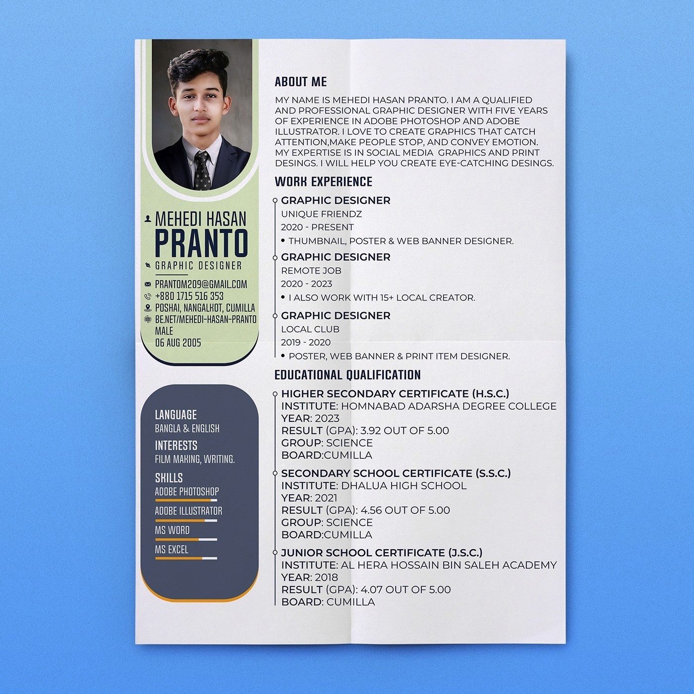
5. Technical Specifications
Software: Adobe Illustrator & Photoshop.
Print Ready: Designed in high-resolution CMYK mode, ensuring the colors remain vibrant and the text remains sharp when printed on professional-grade paper.
More Projects


Brand Identity & Marketing
Creative Identity – Professional Resume & Personal Branding
A modern, high-impact resume design showcasing a balanced two-column layout for maximum readability. This project serves as a personal brand identity, utilizing a clean navy blue and light teal color palette. It is engineered to present 5 years of industry experience, technical skills, and educational background in a visually engaging, professional format.
Year :
2024
Industry :
-
Client :
-
Project Duration :
-
Designing the Designer's Identity
As a graphic designer, your resume is often the very first project a potential client or employer sees. It is more than just a list of facts; it is a demonstration of your ability to organize complex information into a beautiful, scannable experience.
1. The Layout Strategy: Scan ability First
I chose a Modern Two-Column Layout to ensure the document is easy to navigate.
The Left Sidebar: Acting as a "Fast-Track" info center, this section houses my portrait, contact details, and technical skill bars. This allows a recruiter to understand my core competencies in less than 5 seconds.
The Main Body: Dedicated to my professional narrative. By using clear headers like "About Me," "Work Experience," and "Education," I ensured a logical flow of information that guides the reader’s eye downward.
2. Visual Branding & Color Theory
Navy Blue & Slate: I used these colors to establish a sense of authority, trust, and professional maturity.
Light Teal/Green Accents: These softer tones add a creative and "fresh" energy to the design, preventing the document from looking too rigid or corporate.
Skill Bars: Instead of just listing software, I used data visualization (progress bars) to indicate my proficiency levels in Adobe Photoshop, Illustrator, and MS Office.
3. Highlighting Quantitative Success
In the "Work Experience" section, I strategically highlighted my achievements: "Done 100+ Projects & 250+ Designs." Providing these numbers gives potential clients tangible proof of my productivity and experience in the industry.
4. Typography and Hierarchy
I utilized a mix of bold and regular sans-serif fonts to create a strong visual hierarchy. This ensures that even in a crowded document, the most important information—like my name and job titles—stands out immediately.
5. Technical Specifications
Software: Adobe Illustrator & Photoshop.
Print Ready: Designed in high-resolution CMYK mode, ensuring the colors remain vibrant and the text remains sharp when printed on professional-grade paper.
More Projects
Brand Identity & Marketing
Creative Identity – Professional Resume & Personal Branding
A modern, high-impact resume design showcasing a balanced two-column layout for maximum readability. This project serves as a personal brand identity, utilizing a clean navy blue and light teal color palette. It is engineered to present 5 years of industry experience, technical skills, and educational background in a visually engaging, professional format.
Year :
2024
Industry :
-
Client :
-
Project Duration :
-
Designing the Designer's Identity
As a graphic designer, your resume is often the very first project a potential client or employer sees. It is more than just a list of facts; it is a demonstration of your ability to organize complex information into a beautiful, scannable experience.
1. The Layout Strategy: Scan ability First
I chose a Modern Two-Column Layout to ensure the document is easy to navigate.
The Left Sidebar: Acting as a "Fast-Track" info center, this section houses my portrait, contact details, and technical skill bars. This allows a recruiter to understand my core competencies in less than 5 seconds.
The Main Body: Dedicated to my professional narrative. By using clear headers like "About Me," "Work Experience," and "Education," I ensured a logical flow of information that guides the reader’s eye downward.
2. Visual Branding & Color Theory
Navy Blue & Slate: I used these colors to establish a sense of authority, trust, and professional maturity.
Light Teal/Green Accents: These softer tones add a creative and "fresh" energy to the design, preventing the document from looking too rigid or corporate.
Skill Bars: Instead of just listing software, I used data visualization (progress bars) to indicate my proficiency levels in Adobe Photoshop, Illustrator, and MS Office.
3. Highlighting Quantitative Success
In the "Work Experience" section, I strategically highlighted my achievements: "Done 100+ Projects & 250+ Designs." Providing these numbers gives potential clients tangible proof of my productivity and experience in the industry.
4. Typography and Hierarchy
I utilized a mix of bold and regular sans-serif fonts to create a strong visual hierarchy. This ensures that even in a crowded document, the most important information—like my name and job titles—stands out immediately.
5. Technical Specifications
Software: Adobe Illustrator & Photoshop.
Print Ready: Designed in high-resolution CMYK mode, ensuring the colors remain vibrant and the text remains sharp when printed on professional-grade paper.