Brand Identity & Marketing
Creative Business Agency – Professional Trifold Brochure Design
A modern and clean trifold brochure designed for "Asas Factory for Industry." This project features a high-contrast yellow and dark grey color palette, reflecting a balance between creative energy and corporate professionalism. It includes structured sections for services, company overview, and contact information, presented in a high-resolution mockup to demonstrate real-world application.
Year :
2024
Industry :
-
Client :
-
Project Duration :
-

Strategic Layouts for Corporate Success: The Asas Factory Brochure Case Study
In an age of digital saturation, a well-designed physical brochure remains a powerful tool for face-to-face networking and professional presentations. For Asas Factory for Industry, the goal was to create a trifold brochure that instantly communicates authority, innovation, and clarity.
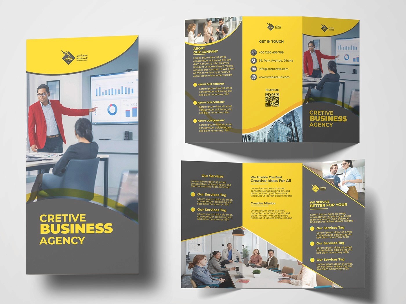
1. The Dynamic Color Palette
The primary visual strength of this brochure lies in its High-Contrast Palette:
Vibrant Yellow: Symbolizes optimism, creative thinking, and energy. It acts as a "visual hook" to grab attention.
Deep Grey/Black: Provides the "anchor" of professional trust, stability, and industrial strength.
This combination ensures the brand looks modern and tech-forward while remaining grounded in corporate values.
2. Information Architecture & Readability
A trifold brochure has six panels, and each must serve a specific purpose. I organized the layout into a logical journey for the reader:
The Front Cover: Features a bold "Creative Business Agency" headline and a strong hero image to set the tone.
The Inside Spread: Focuses on "Our Services" and "Creative Ideas," utilizing clean icons and bullet points to ensure the information is scannable and easy to digest.
The Back Panel: Dedicated to "Get in Touch" and a QR Code, bridging the gap between physical print and digital connectivity.
3. Fluid Geometric Design
To move away from rigid, boxy layouts, I integrated curved and wavy dividers. These organic lines create a sense of movement and "flow," guiding the reader’s eye from one panel to the next. It gives the brochure a premium, custom-designed feel rather than a standard template look.
4. Professional Imagery & Mockup Presentation
I utilized high-quality corporate stock photography to humanize the brand. Presenting the final design in a high-res trifold mockup allows potential clients to see how the folds interact and how the colors translate in a physical space with realistic shadows and highlights.
5. Technical Excellence
Software Suite: Adobe Illustrator (Vector layout) and Adobe Photoshop (Mockup rendering).
Print Specs: Designed with CMYK color mode and bleed margins, ensuring a flawless transition from screen to print.
Conclusion
The Asas Factory Brochure is a testament to the power of balanced design. By combining aggressive colors with fluid geometry and clear information hierarchy, I successfully created a marketing asset that functions as a silent ambassador for the brand’s professional excellence.
More Projects


Brand Identity & Marketing
Creative Business Agency – Professional Trifold Brochure Design
A modern and clean trifold brochure designed for "Asas Factory for Industry." This project features a high-contrast yellow and dark grey color palette, reflecting a balance between creative energy and corporate professionalism. It includes structured sections for services, company overview, and contact information, presented in a high-resolution mockup to demonstrate real-world application.
Year :
2024
Industry :
-
Client :
-
Project Duration :
-
Strategic Layouts for Corporate Success: The Asas Factory Brochure Case Study
In an age of digital saturation, a well-designed physical brochure remains a powerful tool for face-to-face networking and professional presentations. For Asas Factory for Industry, the goal was to create a trifold brochure that instantly communicates authority, innovation, and clarity.
1. The Dynamic Color Palette
The primary visual strength of this brochure lies in its High-Contrast Palette:
Vibrant Yellow: Symbolizes optimism, creative thinking, and energy. It acts as a "visual hook" to grab attention.
Deep Grey/Black: Provides the "anchor" of professional trust, stability, and industrial strength.
This combination ensures the brand looks modern and tech-forward while remaining grounded in corporate values.
2. Information Architecture & Readability
A trifold brochure has six panels, and each must serve a specific purpose. I organized the layout into a logical journey for the reader:
The Front Cover: Features a bold "Creative Business Agency" headline and a strong hero image to set the tone.
The Inside Spread: Focuses on "Our Services" and "Creative Ideas," utilizing clean icons and bullet points to ensure the information is scannable and easy to digest.
The Back Panel: Dedicated to "Get in Touch" and a QR Code, bridging the gap between physical print and digital connectivity.
3. Fluid Geometric Design
To move away from rigid, boxy layouts, I integrated curved and wavy dividers. These organic lines create a sense of movement and "flow," guiding the reader’s eye from one panel to the next. It gives the brochure a premium, custom-designed feel rather than a standard template look.
4. Professional Imagery & Mockup Presentation
I utilized high-quality corporate stock photography to humanize the brand. Presenting the final design in a high-res trifold mockup allows potential clients to see how the folds interact and how the colors translate in a physical space with realistic shadows and highlights.
5. Technical Excellence
Software Suite: Adobe Illustrator (Vector layout) and Adobe Photoshop (Mockup rendering).
Print Specs: Designed with CMYK color mode and bleed margins, ensuring a flawless transition from screen to print.
Conclusion
The Asas Factory Brochure is a testament to the power of balanced design. By combining aggressive colors with fluid geometry and clear information hierarchy, I successfully created a marketing asset that functions as a silent ambassador for the brand’s professional excellence.
More Projects
Brand Identity & Marketing
Creative Business Agency – Professional Trifold Brochure Design
A modern and clean trifold brochure designed for "Asas Factory for Industry." This project features a high-contrast yellow and dark grey color palette, reflecting a balance between creative energy and corporate professionalism. It includes structured sections for services, company overview, and contact information, presented in a high-resolution mockup to demonstrate real-world application.
Year :
2024
Industry :
-
Client :
-
Project Duration :
-
Strategic Layouts for Corporate Success: The Asas Factory Brochure Case Study
In an age of digital saturation, a well-designed physical brochure remains a powerful tool for face-to-face networking and professional presentations. For Asas Factory for Industry, the goal was to create a trifold brochure that instantly communicates authority, innovation, and clarity.
1. The Dynamic Color Palette
The primary visual strength of this brochure lies in its High-Contrast Palette:
Vibrant Yellow: Symbolizes optimism, creative thinking, and energy. It acts as a "visual hook" to grab attention.
Deep Grey/Black: Provides the "anchor" of professional trust, stability, and industrial strength.
This combination ensures the brand looks modern and tech-forward while remaining grounded in corporate values.
2. Information Architecture & Readability
A trifold brochure has six panels, and each must serve a specific purpose. I organized the layout into a logical journey for the reader:
The Front Cover: Features a bold "Creative Business Agency" headline and a strong hero image to set the tone.
The Inside Spread: Focuses on "Our Services" and "Creative Ideas," utilizing clean icons and bullet points to ensure the information is scannable and easy to digest.
The Back Panel: Dedicated to "Get in Touch" and a QR Code, bridging the gap between physical print and digital connectivity.
3. Fluid Geometric Design
To move away from rigid, boxy layouts, I integrated curved and wavy dividers. These organic lines create a sense of movement and "flow," guiding the reader’s eye from one panel to the next. It gives the brochure a premium, custom-designed feel rather than a standard template look.
4. Professional Imagery & Mockup Presentation
I utilized high-quality corporate stock photography to humanize the brand. Presenting the final design in a high-res trifold mockup allows potential clients to see how the folds interact and how the colors translate in a physical space with realistic shadows and highlights.
5. Technical Excellence
Software Suite: Adobe Illustrator (Vector layout) and Adobe Photoshop (Mockup rendering).
Print Specs: Designed with CMYK color mode and bleed margins, ensuring a flawless transition from screen to print.
Conclusion
The Asas Factory Brochure is a testament to the power of balanced design. By combining aggressive colors with fluid geometry and clear information hierarchy, I successfully created a marketing asset that functions as a silent ambassador for the brand’s professional excellence.