Brand Identity & Marketing
Conversion-Focused EdTech Promotional Banner Series
A suite of high-impact web banners designed for various educational platforms. This project showcases a strategic use of color psychology and information hierarchy to drive student enrollments. From high-energy tech aesthetics to professional medical branding, each banner is optimized with clear Calls-to-Action (CTAs) and promotional coupon integrations to maximize marketing ROI.
Year :
2025
Industry :
EdTech
Client :
-
Project Duration :
-

Visualizing Growth: The Strategy Behind High-Conversion EdTech Banners
In the saturated world of online education, a banner has less than two seconds to stop a user’s scroll. For this series of promotional banners, my goal was to bridge the gap between aesthetic appeal and psychological marketing. By developing three distinct visual identities—tech-modern, cinematic-seasonal, and professional-medical—I demonstrated how tailored design can directly influence user engagement.
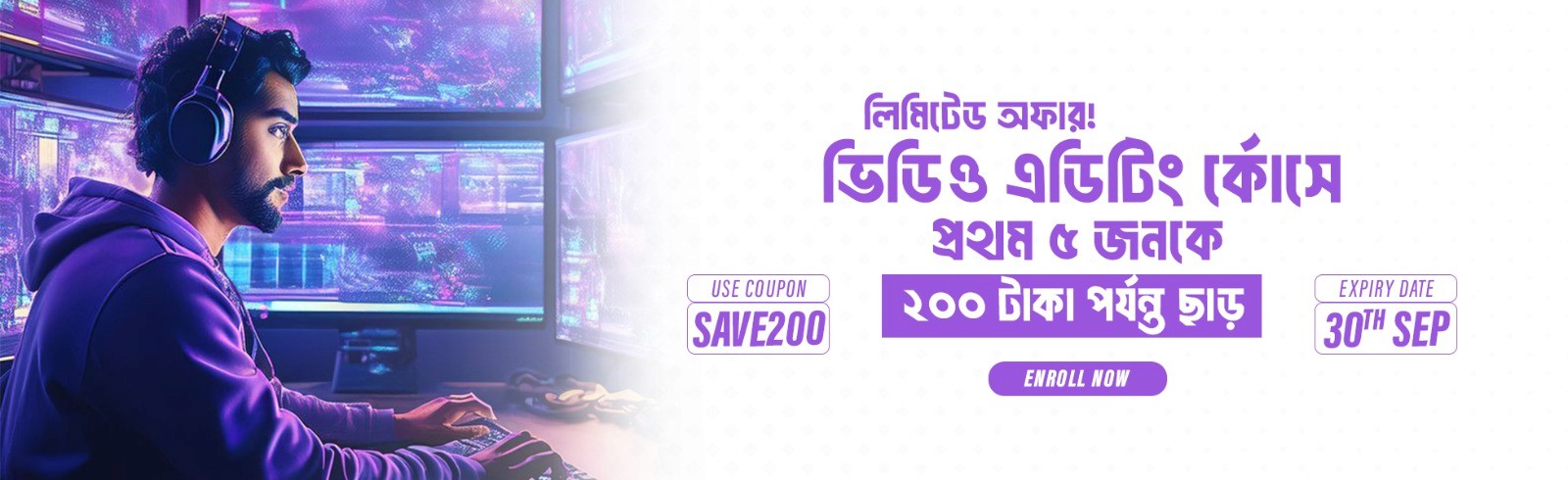
1. The Tech-Modern Aesthetic (Video Editing Course)
For the Video Editing banner, I utilized a Vibrant Purple and Neon palette.
Design Logic: Purple is the color of creativity and imagination. By featuring a high-quality "editor at work" visual with neon lighting, I aimed to inspire aspiring creators.
Conversion Hook: The "SAVE200" coupon is placed in a high-contrast box, and the urgency is reinforced by the "Limited Offer" tag. The clean white space on the right ensures the CTA remains the focal point.
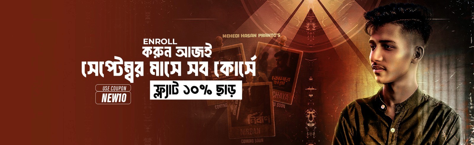
2. The Cinematic-Seasonal Approach (September Sale)
The brown-toned banner was designed for a broader, site-wide September promotion.
Design Logic: Using warm, earthy tones and a grainy, cinematic texture, this banner creates a "Premium" and "Timeless" feel. I integrated movie-poster style thumbnails in the background to showcase the variety of available content.
Conversion Hook: The "FLAT 10% OFF" is rendered in a bold, black-on-white block, making the financial benefit impossible to miss.
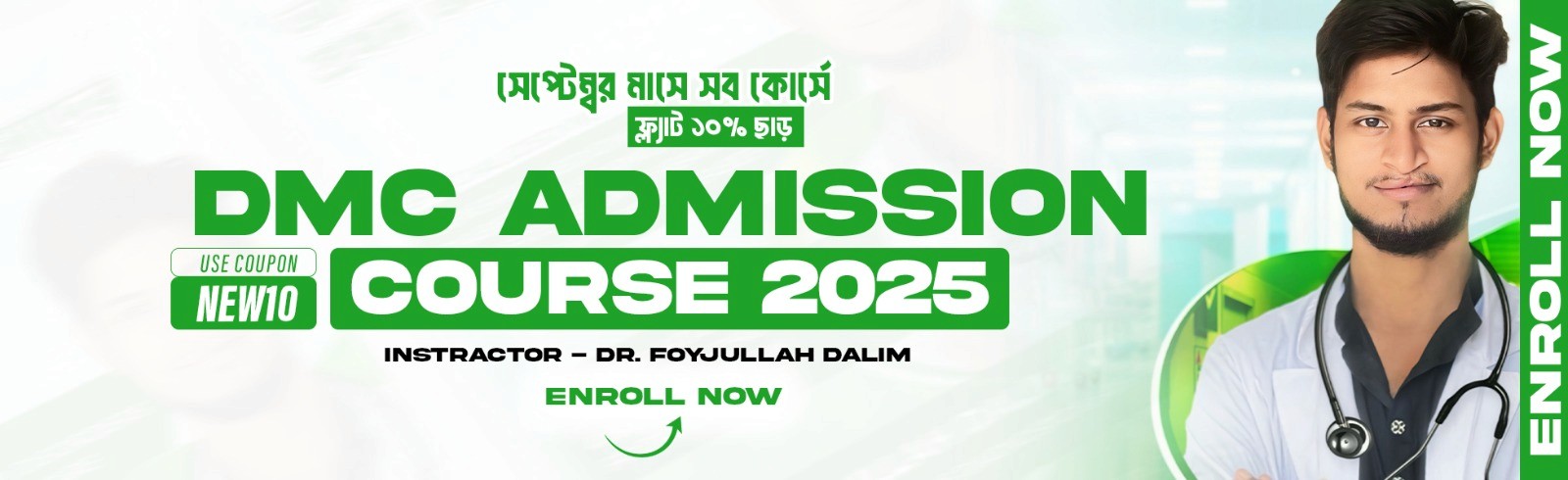
3. The Trust-Based Medical Identity (DMC Admission 2025)
Branding for medical entrance exams requires a shift toward Trust, Authority, and Cleanliness.
Design Logic: I chose a "Medical Green" and white palette. Green symbolizes health, success, and safety. By featuring the instructor, Dr. Foyjullah Dalim, in a professional white coat, I utilized "Authority Bias" to build instant credibility with students and parents.
Conversion Hook: The "ENROLL NOW" text is placed vertically on the far right, acting as a final "closer" for the user’s eye journey as they finish scanning the information.
Technical Strategy & Execution
Across all three designs, I maintained a strict adherence to Information Architecture:
Typography: I utilized bold, weighted fonts for headlines to ensure legibility on mobile devices.
Z-Pattern Layout: The information flows from the visual "hook" on the left to the informational center and finally to the "Call-to-Action" on the right.
Print and Web Ready: Designed with a focus on high-dynamic-range colors to ensure the banners look crisp on Retina and OLED displays.
Conclusion
This series proves that effective design is about more than just "looking good"—it’s about results. By matching the visual tone to the specific niche of each course, these banners serve as a powerful tool for customer acquisition and brand scaling.
More Projects


Brand Identity & Marketing
Conversion-Focused EdTech Promotional Banner Series
A suite of high-impact web banners designed for various educational platforms. This project showcases a strategic use of color psychology and information hierarchy to drive student enrollments. From high-energy tech aesthetics to professional medical branding, each banner is optimized with clear Calls-to-Action (CTAs) and promotional coupon integrations to maximize marketing ROI.
Year :
2025
Industry :
EdTech
Client :
-
Project Duration :
-
Visualizing Growth: The Strategy Behind High-Conversion EdTech Banners
In the saturated world of online education, a banner has less than two seconds to stop a user’s scroll. For this series of promotional banners, my goal was to bridge the gap between aesthetic appeal and psychological marketing. By developing three distinct visual identities—tech-modern, cinematic-seasonal, and professional-medical—I demonstrated how tailored design can directly influence user engagement.
1. The Tech-Modern Aesthetic (Video Editing Course)
For the Video Editing banner, I utilized a Vibrant Purple and Neon palette.
Design Logic: Purple is the color of creativity and imagination. By featuring a high-quality "editor at work" visual with neon lighting, I aimed to inspire aspiring creators.
Conversion Hook: The "SAVE200" coupon is placed in a high-contrast box, and the urgency is reinforced by the "Limited Offer" tag. The clean white space on the right ensures the CTA remains the focal point.
2. The Cinematic-Seasonal Approach (September Sale)
The brown-toned banner was designed for a broader, site-wide September promotion.
Design Logic: Using warm, earthy tones and a grainy, cinematic texture, this banner creates a "Premium" and "Timeless" feel. I integrated movie-poster style thumbnails in the background to showcase the variety of available content.
Conversion Hook: The "FLAT 10% OFF" is rendered in a bold, black-on-white block, making the financial benefit impossible to miss.
3. The Trust-Based Medical Identity (DMC Admission 2025)
Branding for medical entrance exams requires a shift toward Trust, Authority, and Cleanliness.
Design Logic: I chose a "Medical Green" and white palette. Green symbolizes health, success, and safety. By featuring the instructor, Dr. Foyjullah Dalim, in a professional white coat, I utilized "Authority Bias" to build instant credibility with students and parents.
Conversion Hook: The "ENROLL NOW" text is placed vertically on the far right, acting as a final "closer" for the user’s eye journey as they finish scanning the information.
Technical Strategy & Execution
Across all three designs, I maintained a strict adherence to Information Architecture:
Typography: I utilized bold, weighted fonts for headlines to ensure legibility on mobile devices.
Z-Pattern Layout: The information flows from the visual "hook" on the left to the informational center and finally to the "Call-to-Action" on the right.
Print and Web Ready: Designed with a focus on high-dynamic-range colors to ensure the banners look crisp on Retina and OLED displays.
Conclusion
This series proves that effective design is about more than just "looking good"—it’s about results. By matching the visual tone to the specific niche of each course, these banners serve as a powerful tool for customer acquisition and brand scaling.
More Projects
Brand Identity & Marketing
Conversion-Focused EdTech Promotional Banner Series
A suite of high-impact web banners designed for various educational platforms. This project showcases a strategic use of color psychology and information hierarchy to drive student enrollments. From high-energy tech aesthetics to professional medical branding, each banner is optimized with clear Calls-to-Action (CTAs) and promotional coupon integrations to maximize marketing ROI.
Year :
2025
Industry :
EdTech
Client :
-
Project Duration :
-
Visualizing Growth: The Strategy Behind High-Conversion EdTech Banners
In the saturated world of online education, a banner has less than two seconds to stop a user’s scroll. For this series of promotional banners, my goal was to bridge the gap between aesthetic appeal and psychological marketing. By developing three distinct visual identities—tech-modern, cinematic-seasonal, and professional-medical—I demonstrated how tailored design can directly influence user engagement.
1. The Tech-Modern Aesthetic (Video Editing Course)
For the Video Editing banner, I utilized a Vibrant Purple and Neon palette.
Design Logic: Purple is the color of creativity and imagination. By featuring a high-quality "editor at work" visual with neon lighting, I aimed to inspire aspiring creators.
Conversion Hook: The "SAVE200" coupon is placed in a high-contrast box, and the urgency is reinforced by the "Limited Offer" tag. The clean white space on the right ensures the CTA remains the focal point.
2. The Cinematic-Seasonal Approach (September Sale)
The brown-toned banner was designed for a broader, site-wide September promotion.
Design Logic: Using warm, earthy tones and a grainy, cinematic texture, this banner creates a "Premium" and "Timeless" feel. I integrated movie-poster style thumbnails in the background to showcase the variety of available content.
Conversion Hook: The "FLAT 10% OFF" is rendered in a bold, black-on-white block, making the financial benefit impossible to miss.
3. The Trust-Based Medical Identity (DMC Admission 2025)
Branding for medical entrance exams requires a shift toward Trust, Authority, and Cleanliness.
Design Logic: I chose a "Medical Green" and white palette. Green symbolizes health, success, and safety. By featuring the instructor, Dr. Foyjullah Dalim, in a professional white coat, I utilized "Authority Bias" to build instant credibility with students and parents.
Conversion Hook: The "ENROLL NOW" text is placed vertically on the far right, acting as a final "closer" for the user’s eye journey as they finish scanning the information.
Technical Strategy & Execution
Across all three designs, I maintained a strict adherence to Information Architecture:
Typography: I utilized bold, weighted fonts for headlines to ensure legibility on mobile devices.
Z-Pattern Layout: The information flows from the visual "hook" on the left to the informational center and finally to the "Call-to-Action" on the right.
Print and Web Ready: Designed with a focus on high-dynamic-range colors to ensure the banners look crisp on Retina and OLED displays.
Conclusion
This series proves that effective design is about more than just "looking good"—it’s about results. By matching the visual tone to the specific niche of each course, these banners serve as a powerful tool for customer acquisition and brand scaling.