Brand Identity & Marketing
B Tech City – High-Impact E-commerce Gadget Ad
A vibrant and energetic social media advertisement designed for B Tech City, a gadget retail brand. The design features a human-centric approach to build trust, paired with cinematic lighting, dynamic blue sunburst effects, and bold 3D typography. It is engineered to maximize engagement and drive traffic to the brand’s e-commerce platform.
Year :
2025
Industry :
E - Commerce
Client :
Rayhan Talukdar
Project Duration :
1 Days

Humanizing Technology: A Branding Strategy for B Tech City
In the fast-paced world of tech retail, selling a product is only half the battle; the real challenge is building a connection. For B Tech City, my objective was to move beyond a simple product shot and create an advertisement that feels personal, professional, and high-energy.
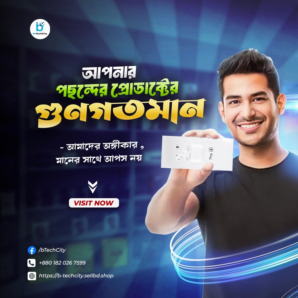
1. The Human Element: Building Instant Trust
Research shows that people connect with people. Instead of a floating gadget, I featured a smiling, approachable character holding the product. This "unboxing" vibe creates an immediate sense of reliability and satisfaction, signaling to the audience that B Tech City isn’t just a shop, but a brand that values its customers' happiness.
2. Dynamic Background & Lighting
To create a high-tech "Digital" atmosphere, I utilized a Blue Sunburst Effect over a blurred background of a tech store.
The Colors: Blue represents trust and technology, while the golden/yellow typography adds a premium "winning" feel.
The Glow: I integrated glowing neon light rings at the bottom, symbolizing high-speed connectivity and modern energy, which perfectly matches the gadget industry.
3. Information Hierarchy & Typography
The primary Bengali headline—"আপনার পছন্দের প্রোডাক্টের গুণগতমান"—uses a heavy 3D font with a gold-to-green gradient.
The Hook: The sub-text emphasizes a commitment to quality ("মানের সাথে আপস নয়"), providing the rational reason to choose this brand.
Visual Balance: The logo is placed at the top left as a seal of quality, while the "VISIT NOW" button acts as a high-contrast focal point for conversion.
4. Composition & Finishing
I used Rim Lighting on the subject to separate him from the dark background, giving the overall design a professional studio-quality look. Every element—from the glowing arcs to the contact bar at the bottom—is placed using the "Rule of Thirds" to ensure a balanced and clean visual journey for the viewer.
Technical Suite
Software: Adobe Photoshop (Advanced Compositing, Character Retouching, and Lighting).
Design Elements: 3D Typography, Light Trails, and Bokeh Effects.
Goal: To increase Brand Recall and Click-Through Rate (CTR).
Conclusion
The B Tech City gadget ad is a testament to the power of strategic visual marketing. By blending human emotion with high-tech aesthetics and clear calls to action, I successfully delivered a visual that doesn't just show a product—it builds a professional promise of quality.
More Projects


Brand Identity & Marketing
B Tech City – High-Impact E-commerce Gadget Ad
A vibrant and energetic social media advertisement designed for B Tech City, a gadget retail brand. The design features a human-centric approach to build trust, paired with cinematic lighting, dynamic blue sunburst effects, and bold 3D typography. It is engineered to maximize engagement and drive traffic to the brand’s e-commerce platform.
Year :
2025
Industry :
E - Commerce
Client :
Rayhan Talukdar
Project Duration :
1 Days
Humanizing Technology: A Branding Strategy for B Tech City
In the fast-paced world of tech retail, selling a product is only half the battle; the real challenge is building a connection. For B Tech City, my objective was to move beyond a simple product shot and create an advertisement that feels personal, professional, and high-energy.
1. The Human Element: Building Instant Trust
Research shows that people connect with people. Instead of a floating gadget, I featured a smiling, approachable character holding the product. This "unboxing" vibe creates an immediate sense of reliability and satisfaction, signaling to the audience that B Tech City isn’t just a shop, but a brand that values its customers' happiness.
2. Dynamic Background & Lighting
To create a high-tech "Digital" atmosphere, I utilized a Blue Sunburst Effect over a blurred background of a tech store.
The Colors: Blue represents trust and technology, while the golden/yellow typography adds a premium "winning" feel.
The Glow: I integrated glowing neon light rings at the bottom, symbolizing high-speed connectivity and modern energy, which perfectly matches the gadget industry.
3. Information Hierarchy & Typography
The primary Bengali headline—"আপনার পছন্দের প্রোডাক্টের গুণগতমান"—uses a heavy 3D font with a gold-to-green gradient.
The Hook: The sub-text emphasizes a commitment to quality ("মানের সাথে আপস নয়"), providing the rational reason to choose this brand.
Visual Balance: The logo is placed at the top left as a seal of quality, while the "VISIT NOW" button acts as a high-contrast focal point for conversion.
4. Composition & Finishing
I used Rim Lighting on the subject to separate him from the dark background, giving the overall design a professional studio-quality look. Every element—from the glowing arcs to the contact bar at the bottom—is placed using the "Rule of Thirds" to ensure a balanced and clean visual journey for the viewer.
Technical Suite
Software: Adobe Photoshop (Advanced Compositing, Character Retouching, and Lighting).
Design Elements: 3D Typography, Light Trails, and Bokeh Effects.
Goal: To increase Brand Recall and Click-Through Rate (CTR).
Conclusion
The B Tech City gadget ad is a testament to the power of strategic visual marketing. By blending human emotion with high-tech aesthetics and clear calls to action, I successfully delivered a visual that doesn't just show a product—it builds a professional promise of quality.
More Projects
Brand Identity & Marketing
B Tech City – High-Impact E-commerce Gadget Ad
A vibrant and energetic social media advertisement designed for B Tech City, a gadget retail brand. The design features a human-centric approach to build trust, paired with cinematic lighting, dynamic blue sunburst effects, and bold 3D typography. It is engineered to maximize engagement and drive traffic to the brand’s e-commerce platform.
Year :
2025
Industry :
E - Commerce
Client :
Rayhan Talukdar
Project Duration :
1 Days
Humanizing Technology: A Branding Strategy for B Tech City
In the fast-paced world of tech retail, selling a product is only half the battle; the real challenge is building a connection. For B Tech City, my objective was to move beyond a simple product shot and create an advertisement that feels personal, professional, and high-energy.
1. The Human Element: Building Instant Trust
Research shows that people connect with people. Instead of a floating gadget, I featured a smiling, approachable character holding the product. This "unboxing" vibe creates an immediate sense of reliability and satisfaction, signaling to the audience that B Tech City isn’t just a shop, but a brand that values its customers' happiness.
2. Dynamic Background & Lighting
To create a high-tech "Digital" atmosphere, I utilized a Blue Sunburst Effect over a blurred background of a tech store.
The Colors: Blue represents trust and technology, while the golden/yellow typography adds a premium "winning" feel.
The Glow: I integrated glowing neon light rings at the bottom, symbolizing high-speed connectivity and modern energy, which perfectly matches the gadget industry.
3. Information Hierarchy & Typography
The primary Bengali headline—"আপনার পছন্দের প্রোডাক্টের গুণগতমান"—uses a heavy 3D font with a gold-to-green gradient.
The Hook: The sub-text emphasizes a commitment to quality ("মানের সাথে আপস নয়"), providing the rational reason to choose this brand.
Visual Balance: The logo is placed at the top left as a seal of quality, while the "VISIT NOW" button acts as a high-contrast focal point for conversion.
4. Composition & Finishing
I used Rim Lighting on the subject to separate him from the dark background, giving the overall design a professional studio-quality look. Every element—from the glowing arcs to the contact bar at the bottom—is placed using the "Rule of Thirds" to ensure a balanced and clean visual journey for the viewer.
Technical Suite
Software: Adobe Photoshop (Advanced Compositing, Character Retouching, and Lighting).
Design Elements: 3D Typography, Light Trails, and Bokeh Effects.
Goal: To increase Brand Recall and Click-Through Rate (CTR).
Conclusion
The B Tech City gadget ad is a testament to the power of strategic visual marketing. By blending human emotion with high-tech aesthetics and clear calls to action, I successfully delivered a visual that doesn't just show a product—it builds a professional promise of quality.